
Thursday, October 18, 2012
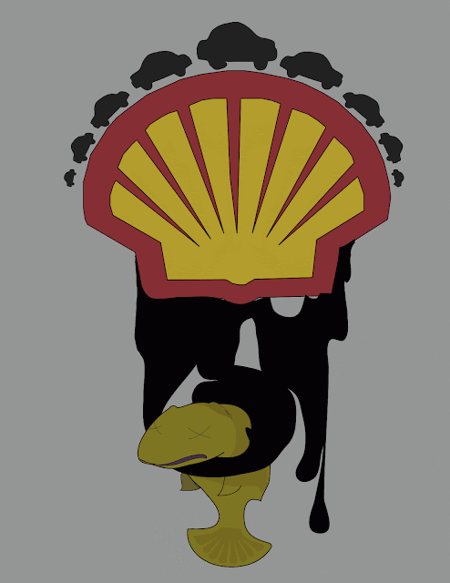
Logo Challenge
So- You probably can guess what I was trying to say... every choice from color to shape was deliberate in order to get my point across.

Sunday, October 14, 2012
Artist Post: Piet Mondrian
As I began researching for artists
that I found of interest, I came across Composition with Red, Yellow and
Blue (1921) and decided to delve deeper into what this image
represented. I have undoubtedly seen
this painting before; however, I never knew what was going on in the piece or
who was responsible for its creation. Composition with Red, Yellow and Blue,
simple as it may appear, possesses
a great deal of information. After
researching more about this piece and Piet Mondrian, I feel I have gained a
much better understanding about composition, color, and the ideas behind
non-representational art that I hope to carry into my own digital artworks.

Piet Mondrian, the mastermind
behind many of the geometric appearing artworks, was hugely affected by World
War I in the early 1900’s. Consequently,
his art changed into very non-representational pieces. After seeing the
devastating effects of the war, he felt that life was too ugly and he therefore
did not want to represent anything from life. Rather, he claimed that beauty
lived within geometry and that through these forms, universal harmony could be
found. Interestingly, the artworks are similar to the aerial view of city streets. The abstractions were broken down into lines and shapes of different
sized of rectangles and squares. Only
primary colors were used throughout the artworks. To me, I find it fascinating
how color can impact one’s visual experience through the various color
interactions. There is a true balance shared between these primary colors that
make the painting visually “relaxing” almost. My eye is immediately drawn to
the largeness of the red in Composition with Red, Yellow and Blue, and then it movies on to the yellow and then
the blue. These colors are almost uncomfortably cropped off in my opinion. However, my eye is never lost as my focus is always shifting from block
to block or line to line continuously around the piece. Again, the experience
to me is very relaxing. In addition to the choice in color palette, Piet
creates a unified composition through his use of stark black lines. My favorite
part about this piece is the oscillating effects by the lines which are tugging
back and forth. If you stare for the right amount of time, the lines begin to
move up and down and left to right. It’s almost kinetic looking. Mondrian
accomplished this through the placement and thicknesses of the lines.

Composition with Red, Yellow and Blue 1921
I feel that the artworks created by Mondrian are relevant to not just
digital art, but all types of art. The paintings initially appear very simple;
but, this simplicity is what I find to be so genius. How might I go about
creating my own artworks through simplicity? I feel that I am very susceptible
to “overworking” my works of art and thus this is quite the challenge to me. How
might I find the harmony that Mondrian has depicted?


Composition with Gray and Light Brown 1918
Work cited:

Wednesday, October 10, 2012

Thursday, October 4, 2012

Monday, October 1, 2012
Portraits~!~ (5)

http://wallpaper-wide.ru/en/preview.php?hd=14626&px=1280x1024

http://liveloveandshoot.com/tag/fashion/


scarlett johansson http://liveloveandshoot.com/tag/fashion/

My attempt to do a self-portrait (oil)
Tis all for now.
Wednesday, September 26, 2012
Artist Post 2: Harold Cohen

Digital print with varnish
Who would have thought that robots are unleashing their own creative spirit and creating original artwork? Harold Cohen, an English abstract painter, became interested in computing and artificial intelligence after a visit to UCSD in 1968. Harold then began his 23 years of research that delved into the development of a rather “different” computer controlled robot that ventured in the world of artificial intelligence. The program is named AARON and the robotic mind is specialized to create art. Aaron, the name of the robot, comes up with several new images during the night. Harold then chooses one of the images Aaron had thought up. For the next couple of hours Aaron gets to work and draws lines, mixes colors, and begins to physically paint abstract imaginary (mind you, not in the same form you might expect to see a human painting in). The robot even cleans the brushes! "AARON can make paintings of anything it knows about, but it actually knows about very little -- people, potted plants and trees, simple objects like boxes and tables, decoration” says Harold regarding the artworks of Aaron.
Harold Cohen quotes, "I wrote it to discover what independent (machine) intelligence might do, given some knowledge of the world and some rudimentary physical capabilities. And, in the process, to have IT teach ME about possibilities I hadn't imagined. I'd be happier if AARON's work in the future were LESS like human work, not MORE like human work."
Aaron is the first robot ever to create an original piece of artwork. The idea came from investigations regarding the natural representations of how human being’s see marks on a paper as a recognizable image (like a shoe) or other known objects from the tangible world. I find it fascinating that a robotic mind can create something new. It almost seems to violate the idea that people are special because we are innovators. If Aaron is able to create the images as seen in this post, I can’t imagine the other possibilities. It’s refreshing when creativity can be made from robotics rather than just scientific output. I am curious, however, as to why Aaron has such a specific style of art. I realize that Harold was the creator, and thus must have the largest influence on Aaron- but, it would be interesting if information from past artists were to flow through the robotic mind. What mixture of art would Aaron come up with then? I do believe that creativity is not as creative as we all may think. It has to come from somewhere in my opinion, much as the same way that Aaron thinks up artwork.

Digital print with varnish

(Screen Print)

Digital print with varnish


References:
http://crca.ucsd.edu/~hcohen/
http://www.kurzweilcyberart.com/aaron/hi_cohenbio.html
http://en.wikipedia.org/wiki/AARON
Subscribe to:
Posts (Atom)