Tuesday, October 30, 2012
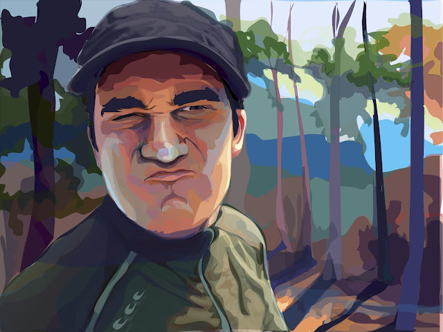
Final: Portrait
Here it is! I'm at last finished I believe. My main goal in this piece was to create volume using shading and light. I wanted the portrait to be dramatic by creating a "spot light" effect using light's filtering effects through the forest canopy.
Tuesday, October 23, 2012
Thursday, October 18, 2012
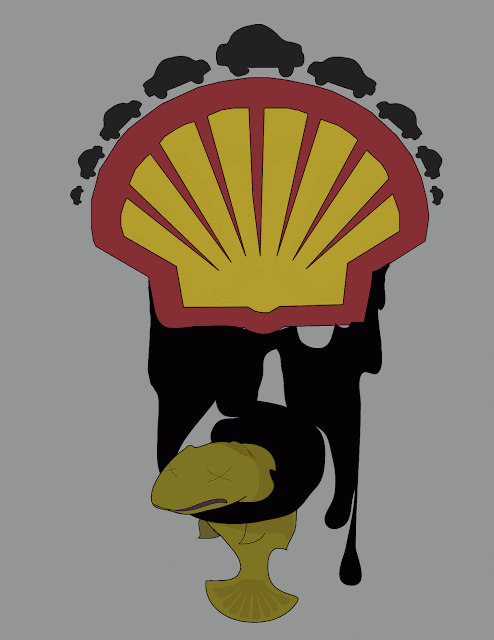
Logo Challenge
So- You probably can guess what I was trying to say... every choice from color to shape was deliberate in order to get my point across.
Sunday, October 14, 2012
Artist Post: Piet Mondrian
As I began researching for artists
that I found of interest, I came across Composition with Red, Yellow and
Blue (1921) and decided to delve deeper into what this image
represented. I have undoubtedly seen
this painting before; however, I never knew what was going on in the piece or
who was responsible for its creation. Composition with Red, Yellow and Blue,
simple as it may appear, possesses
a great deal of information. After
researching more about this piece and Piet Mondrian, I feel I have gained a
much better understanding about composition, color, and the ideas behind
non-representational art that I hope to carry into my own digital artworks.
Piet Mondrian, the mastermind
behind many of the geometric appearing artworks, was hugely affected by World
War I in the early 1900’s. Consequently,
his art changed into very non-representational pieces. After seeing the
devastating effects of the war, he felt that life was too ugly and he therefore
did not want to represent anything from life. Rather, he claimed that beauty
lived within geometry and that through these forms, universal harmony could be
found. Interestingly, the artworks are similar to the aerial view of city streets. The abstractions were broken down into lines and shapes of different
sized of rectangles and squares. Only
primary colors were used throughout the artworks. To me, I find it fascinating
how color can impact one’s visual experience through the various color
interactions. There is a true balance shared between these primary colors that
make the painting visually “relaxing” almost. My eye is immediately drawn to
the largeness of the red in Composition with Red, Yellow and Blue, and then it movies on to the yellow and then
the blue. These colors are almost uncomfortably cropped off in my opinion. However, my eye is never lost as my focus is always shifting from block
to block or line to line continuously around the piece. Again, the experience
to me is very relaxing. In addition to the choice in color palette, Piet
creates a unified composition through his use of stark black lines. My favorite
part about this piece is the oscillating effects by the lines which are tugging
back and forth. If you stare for the right amount of time, the lines begin to
move up and down and left to right. It’s almost kinetic looking. Mondrian
accomplished this through the placement and thicknesses of the lines.
Composition with Red, Yellow and Blue 1921
I feel that the artworks created by Mondrian are relevant to not just
digital art, but all types of art. The paintings initially appear very simple;
but, this simplicity is what I find to be so genius. How might I go about
creating my own artworks through simplicity? I feel that I am very susceptible
to “overworking” my works of art and thus this is quite the challenge to me. How
might I find the harmony that Mondrian has depicted?
Composition with Gray and Light Brown 1918
Work cited:
Wednesday, October 10, 2012
Thursday, October 4, 2012
Monday, October 1, 2012
Portraits~!~ (5)
Lady gaga
http://wallpaper-wide.ru/en/preview.php?hd=14626&px=1280x1024
http://wallpaper-wide.ru/en/preview.php?hd=14626&px=1280x1024
http://liveloveandshoot.com/tag/fashion/
scarlett johansson http://liveloveandshoot.com/tag/fashion/
My attempt to do a self-portrait (oil)
Tis all for now.
Subscribe to:
Comments (Atom)


